Q&A with Isis Goldstein about designing her brand. A client’s story.
I have had the pleasure of working with Isis on her brand and website. This project was a real treat and a collaboration through and through. We went from rebranding her old logo and look and feel to creating a new creative and elaborate website to designing marketing collateral (read: businesscards, postcards, posters etc.) and a crazy sign above her shop. What a journey it has been!
I was interested in what the experience had been for Isis so I decided to ask her! Read about Isis’ view on her experience of working with me and redesigning her brand and website.
I love seeing my intuition interpreted by you.
Tell me about your shop Knutsel Frutsel. What do you sell, when did you start and what is the story behind it?
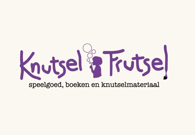
Knutsel Frutsel had an outdated logo that still stemmed from the first days of the business.
What is important to you regarding your customer?
I want the customer to have a happy experience. To be a child in a sweets shop. Whether the customer is the child or the adult…I still want to them to be enthralled and experience a sense of wonder. Wonder at the amount, the colours but definitely also the beauty of the products. That beauty can be aesthetic, but also clever, novel, exciting and functional. I want the shop to feel available and abundant. We do that by filling the shop and bringing order in the abundance. The products are to be found and not put on a pedestal, like in a boutique. We let our customers wander about to discover and offer extensive information and advice to those who want it. It’s a shop where neighbours bump into each other and chat while another customer can rush in and out with a well sought out wrapped present. Though we have many higher end products, the shop caters to all price ranges. I want it to be available to all the neighbourhood, no matter the budget, so I make an effort to have gifts for those budgets.
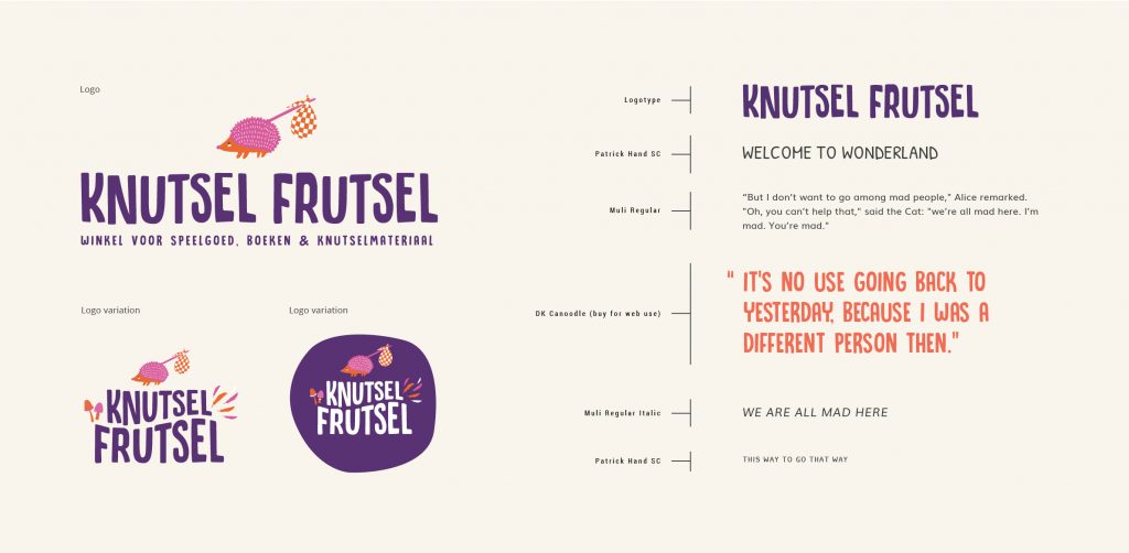
The new branding for Knutsel Frutsel.
What was the reason you sought out a designer to design your brand and website? Why did you think you needed a new brand?
I remember you once told me you didn’t like the word “branding”, why is that?
What was it like for you to start with the branding process? From exploring your vision, your wishes, gathering visual inspiration and ideas to having someone interpret all this into a design? For example, was it exciting, scary, clear cut, boring?
After I presented you with your new brand, the logo, colour scheme etc. you said you understood what it meant to have a well designed brand. That it became clear to you why it is good to have a consistent matching look & feel for your business. Could you elaborate on that?
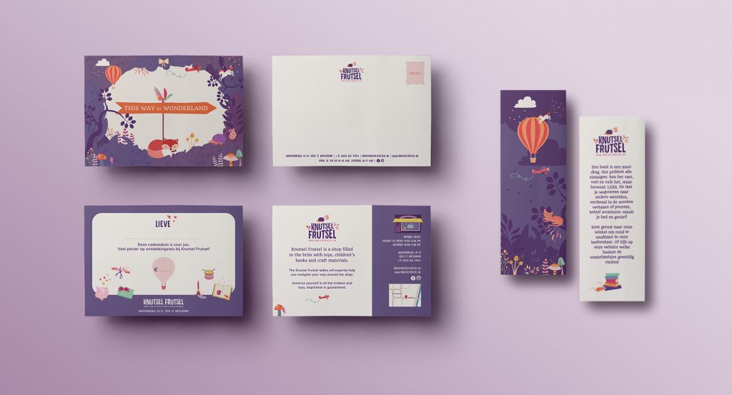
The designs for postcards and bookmarks.
What was your favourite part of this process, of our collaboration?
I love seeing my intuition interpreted by you, the tweaking, the ordering of the product and then having the finished product in my hands. I love that my enthusiasm spreads….that I now see that the branding can go onto everything from gift certificates to price cards to information signs on the door. I didn’t realise when we started that our relationship would be so long term. I now see that branding for my shop is an ongoing process. That the story continues as does your creativity.
What was the reason you chose to work with me?
I chose to work with you because looking at your portfolio I recognised the need to play. And that was the only portfolio I saw doing that.
What has this branding process, and the designs, given you and/or your business?
Click here to see the project.
Latest Posts
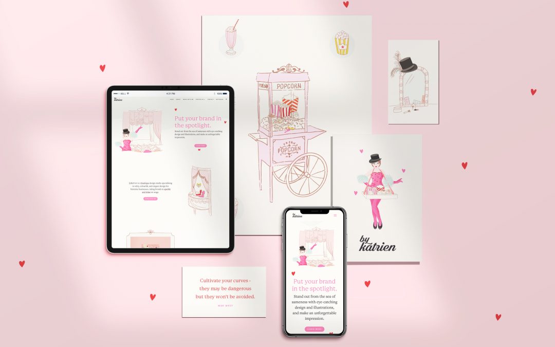
I refreshed my branding and website!
My work is always evolving and so is my own brand. I felt it needed to be refreshed and brightened up and my showgirl also needed a make-over.
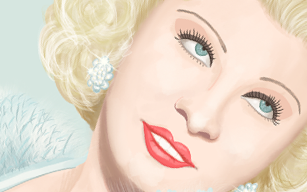
You don’t need to invent your brand, just like you don’t have to invent your own personality.
All is there already, just enhance, exaggerate and show it. Which is something Mae West understood like no other.
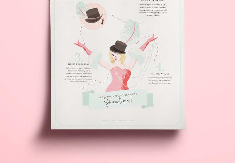
Get your show on the road. My branding process in 4 steps.
A strong brand is more than a website and a pretty logo. If you’re ready to develop your brand with depth and purpose, then you need the foundation to last.
Interested in working together?
Book your free 30-minute introductory call with me and share your challenges, ask questions, and talk about how I can help you. Click the button below, and I’ll look forward to helping you define the next best step for you.
