Brand Identity for a Toy Shop designed by Katrien: a Case Study
This is a case study of the design process for the brand identity for a toyshop in Amsterdam, Knutsel Frutsel, where I show a bit of the process and results of this creative project.
Brand Identity for a toy shop
First step: discovery phase
Moodboarding
Creating moodboards is about getting the look&feel of the brand right, it serves as inspiration and helps when starting the design process.
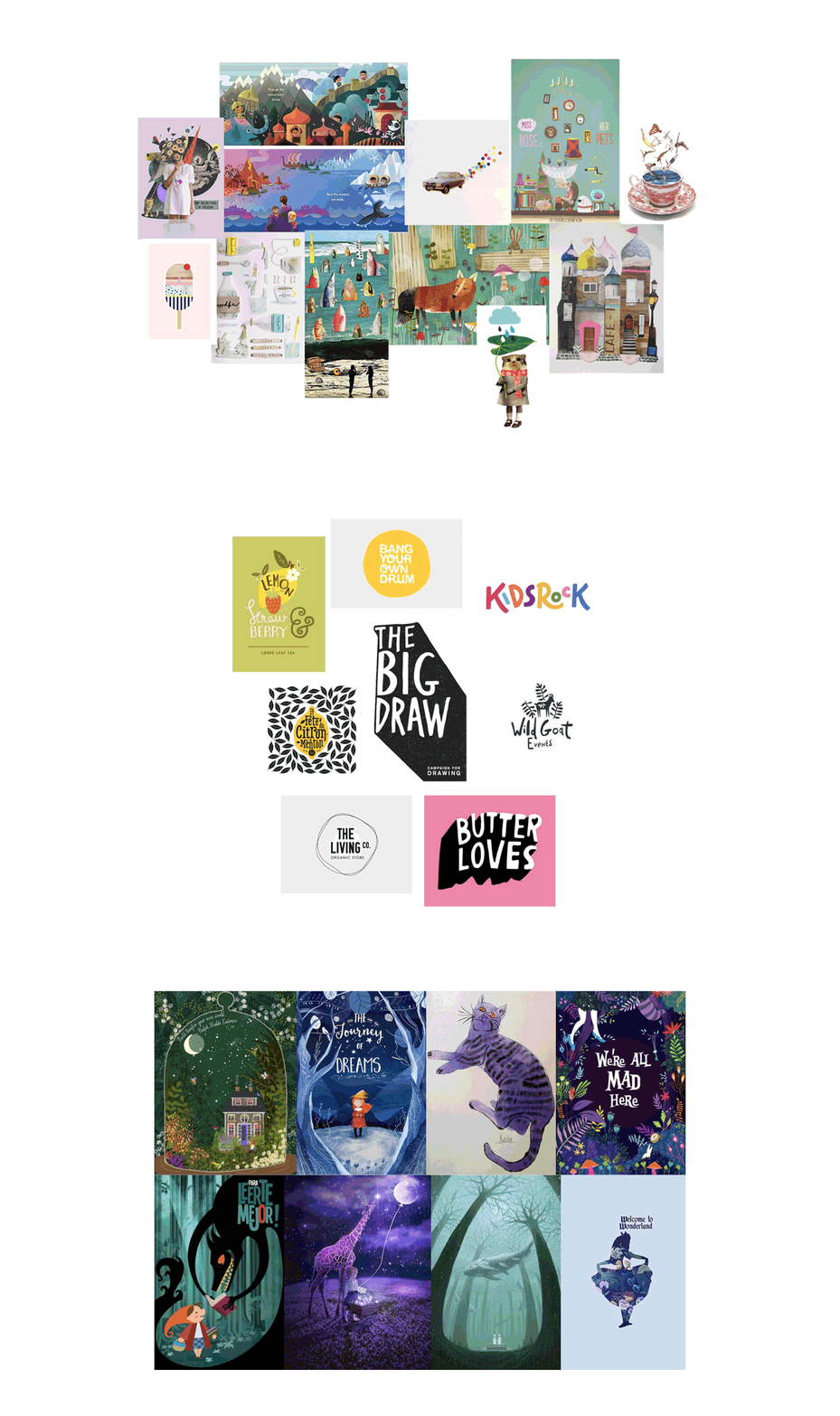
moodboards: playful, illustrations, busy, storytelling, logo inspiration, fairy tales, adventure, colour purple
Brand Identity for a toy shop
From an idea to a logo design
I started out looking for the right feel of the logo, first trying some hand lettering and playful fonts, combining it with small illustrations. Designing takes time and is a creative process. You can see how the logo developed over time to what it is now.
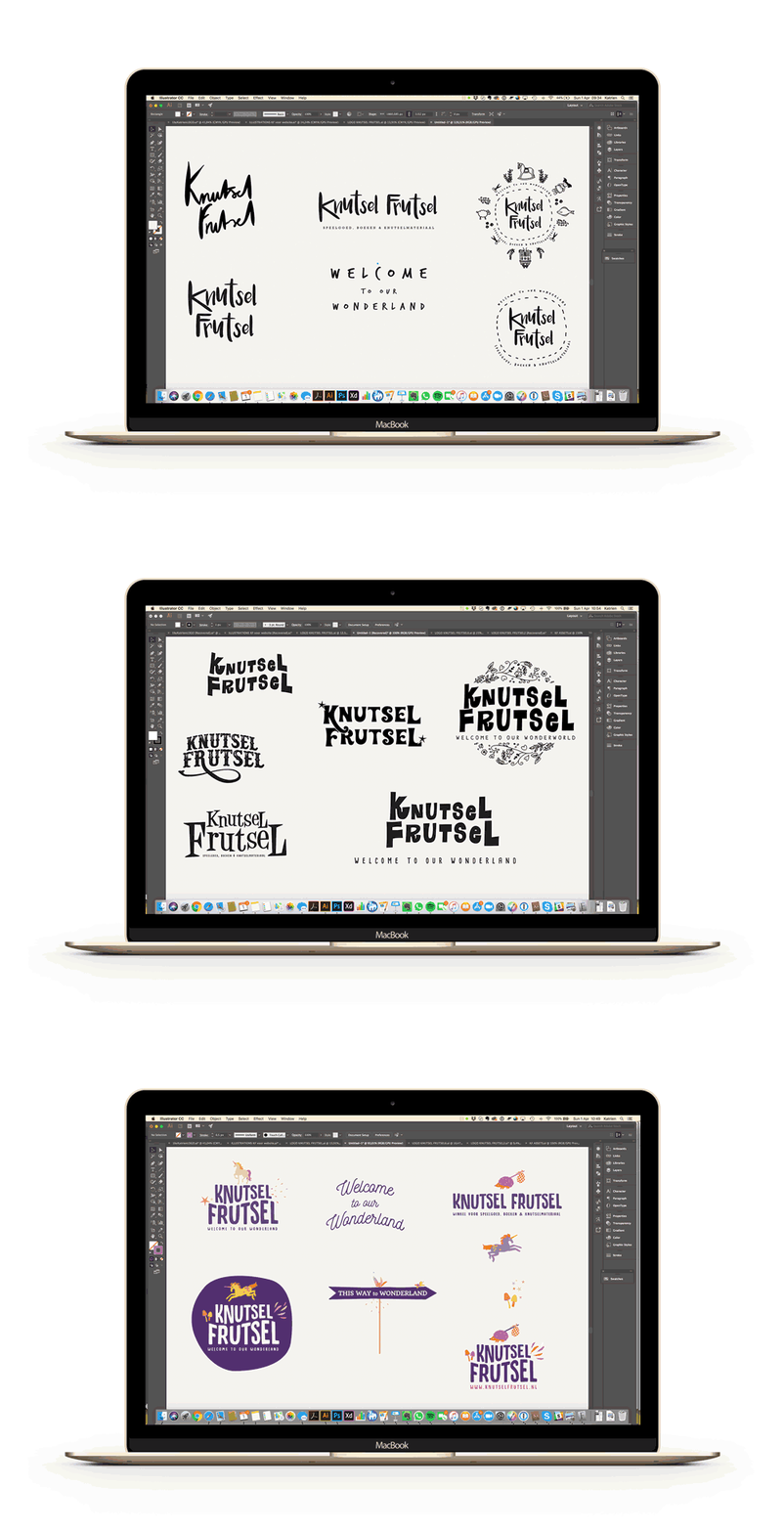 from and idea to a logo design
Illustrations
Throughout the design process I created little illustrations telling a creative wonderworld story that I would finally use in the website.
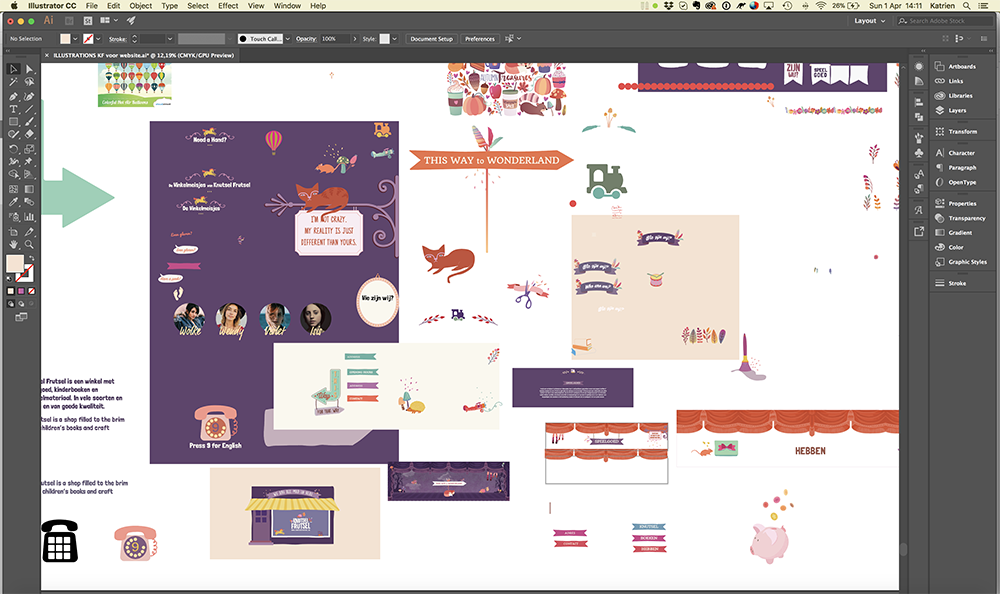
my messy, but creative, workspace 😊
Website
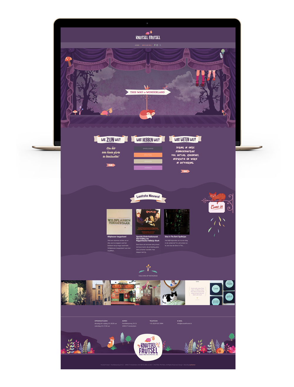
The idea for the website was to create a stage as opening page, inviting the audience to come in to the wonderworld of the Knutsel Frutsel Toy Shop. I added some animation to this scene as well.
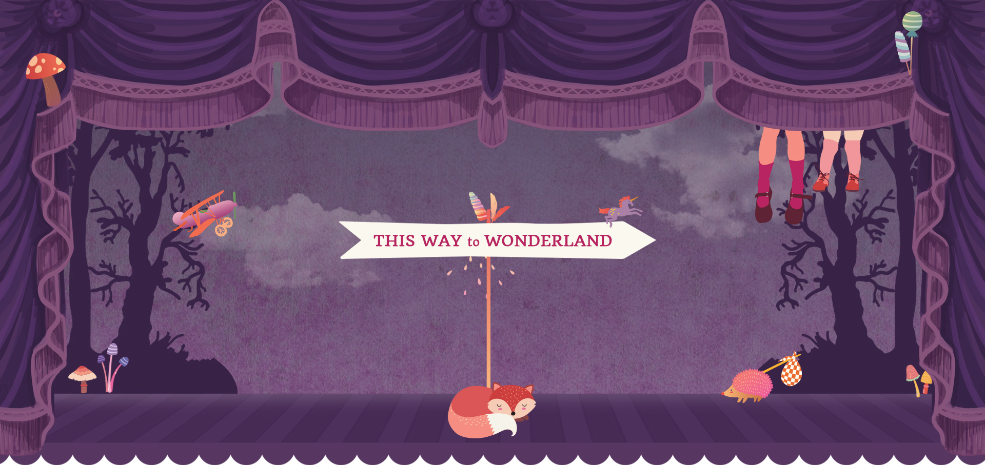
The website is designed to entertain and entice, it’s a fun experience, a wonderworld to discover. You can visit the website here!
Brand Identity for a toy shop
Packaging & businesscards
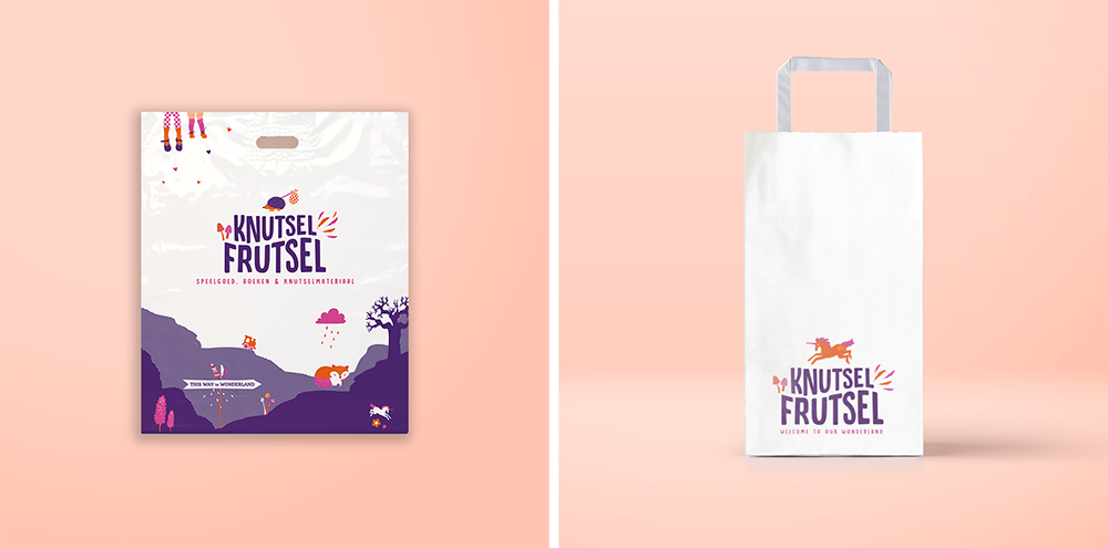
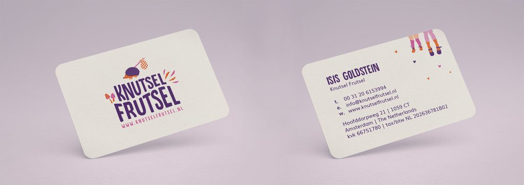
The great thing about brand design is creating an engaging experience for the customer. Isn’t it fun to carry your purchased toys and crafting supplies in a beautifully illustrated bag or get a fun business card?
The shop front
Because the shop consists of 2 different shop windows and Isis wanted to connect the shop fronts and at the same time give information about what the shop sells, it was quite a challenge to create something that would work. Again, the storytelling quality of the illustrations was added to the signage as well. The signage was made by Tintotaal in Amsterdam and they did a great job!
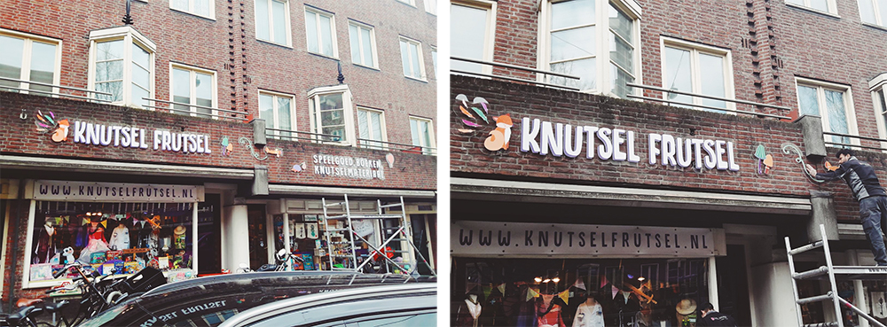
The guys from Tintotaal are fixing the new signage to the shop front of Knutsel Frutsel.
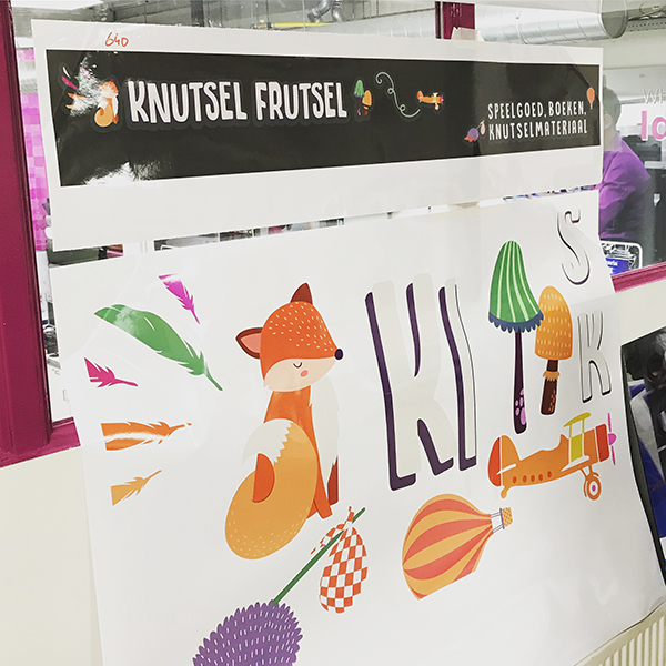
Colour proofing the sticker material for the signage at Tintotaal.
Posters & Postcards
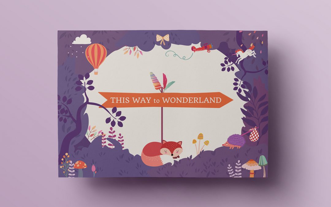
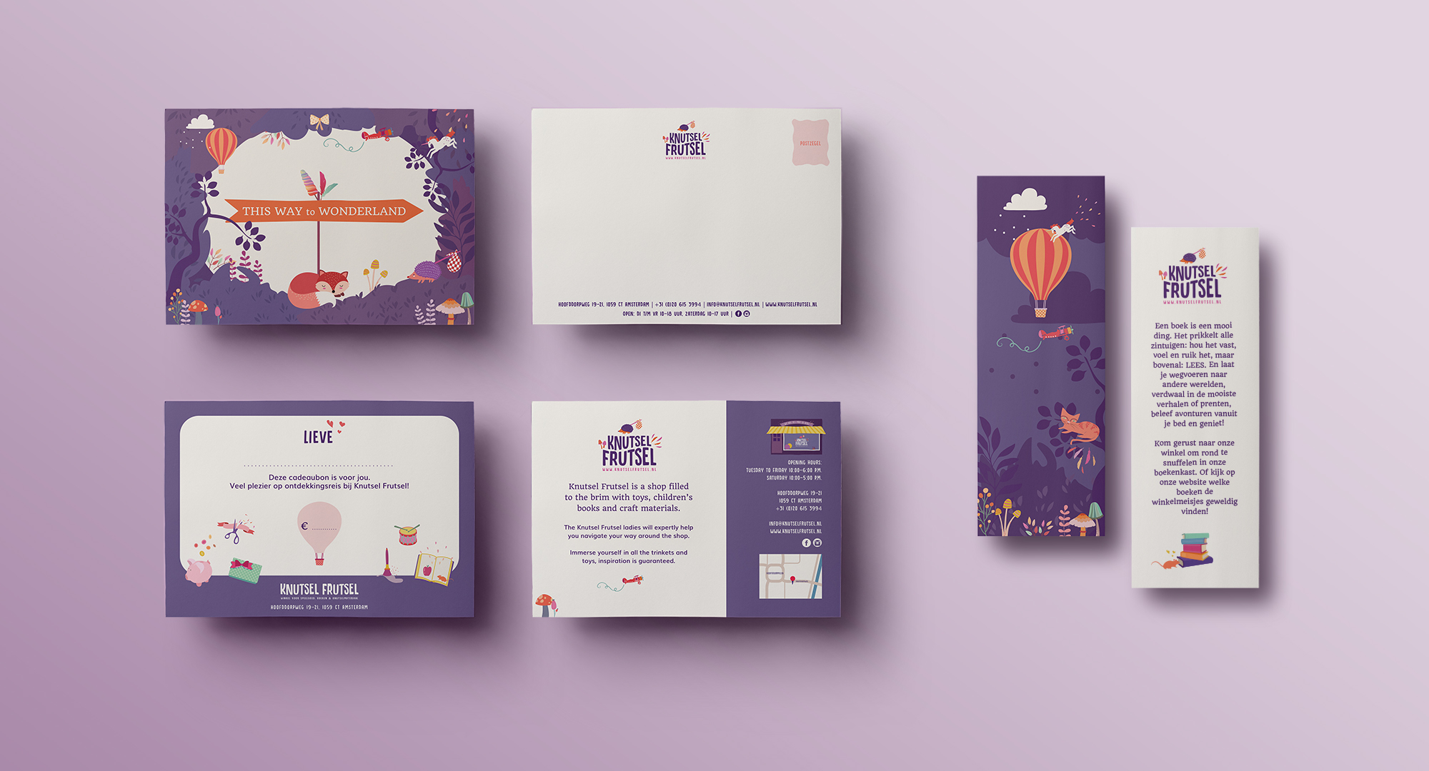
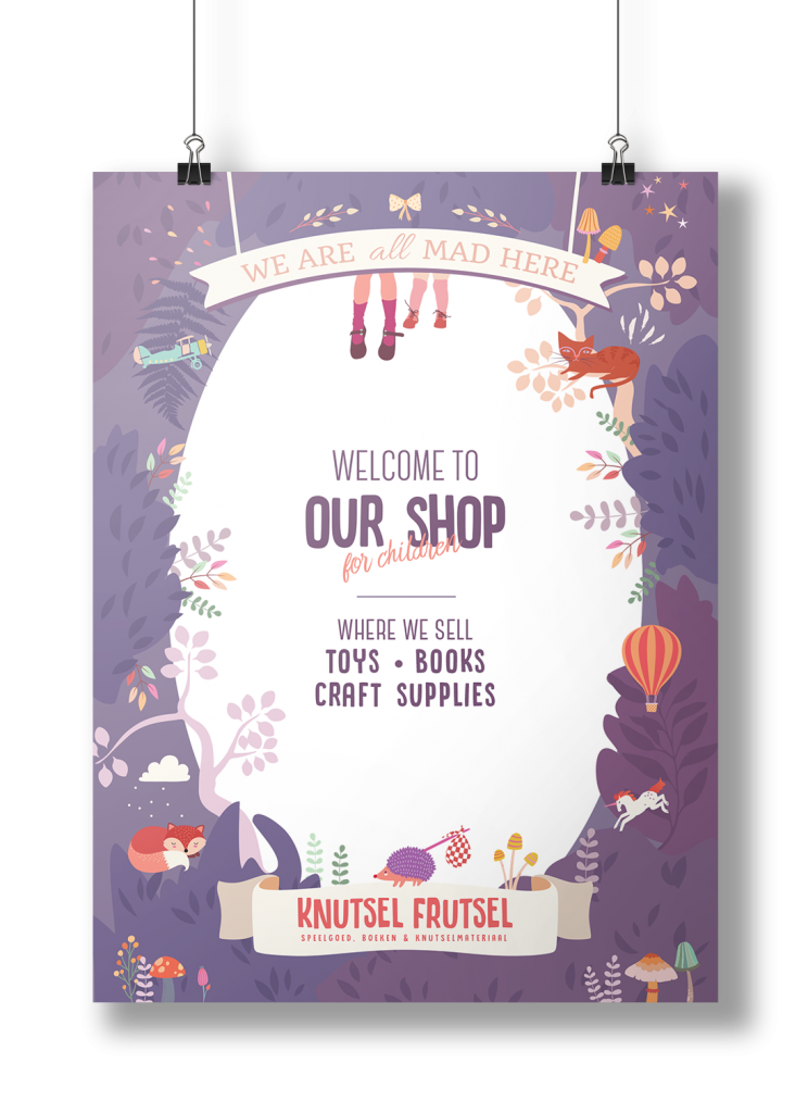
And then finally, I was asked to design the marketing collateral: poster design, postcards, giftcards, bookmarks and price tags. Again. I wanted to create a scene, a little world, and I started sketching a first idea and background on my iPad which I then finished in Illustrator. It was so much fun to design this!
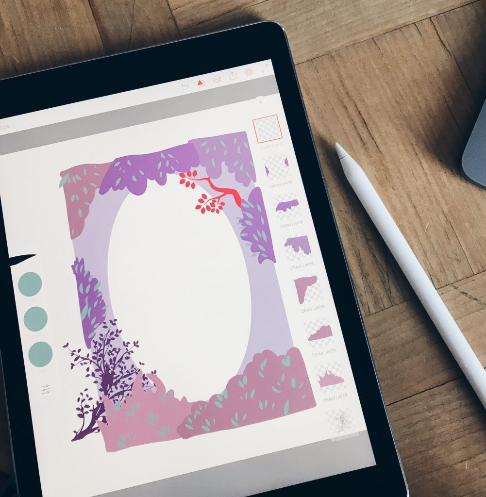
First tentative design on the iPad.
Finally…
It was a great project to design, the creativity of Isis and her team has really added to this inspired journey. The results are super and have given the Knutsel Frutsel shop a professionality and an immersive brand experience for the customer that was lacking before. These projects often take time, where the client and the designer work together and the brand develops over time. The final designs are the result of a good creative collaboration between me and the client.
Here is an overview of what we have done for Knutsel Frutsel that has resulted in this true brand experience:
- Brand Discovery
- Brand Identity
- Website
- Packaging & stickers
- Businesscards
- Signage
- Marketing Collateral
Have a look at the project page here where I showcase the work I’ve done for this brand.
Brand Identity for a toy shop
Did you like this so much that you want a brand identity designed by Katrien as well for your business? Contact me now!
